Collection of free HTML and pure CSS blur effect code examples
Discover a collection of free HTML and pure CSS blur effect code examples to add stylish and smooth blur effects to images, text, and elements on your website.
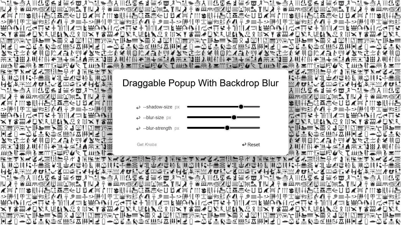
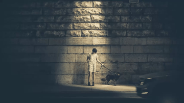
A Draggable Popup with Backdrop Blur in HTML & CSS
About a code The HTML structure is quite simple, with a div element having a class of popup and an h1 tag inside it. The box-shadow and backdrop-filter properties are used to create a blur effect behind the popup. The mask property is used to create a gradient effect. The JavaScript makes the popup draggable using the jQuery UI’s draggable function. It also uses the Knobs library to create interactive knobs that allow the user to adjust the shadow size, blur size, and blur strength of the popup. Dependencies: jquery.js, jquery-ui.js, knobs.js.
About a code
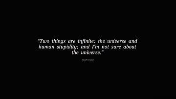
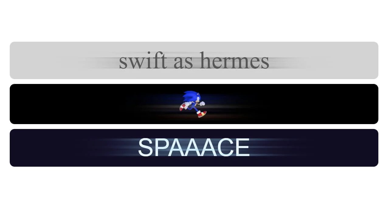
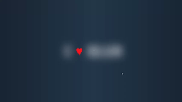
Quote Effect using a CSS Blur Filter
About a code The quote is broken down into individual span elements for each word or punctuation mark. Each span contains data attributes specifying the duration, delay, and blur amount for the animation. Specific styles are applied to animate the span elements from a blurred state to clear text. A JavaScript function animate() iteratively applies animation styles to each word based on its data attributes. After all words are animated, they return to their initial state and the animation repeats. Dependencies: tweenmax.js.
About a code
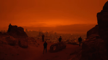
Dynamic Background Image with CSS Blur Effect
About a code This code snippet is a great example of how CSS can be used to create visually appealing effects on web pages. The combination of a dynamic background image with a blur effect and animation can make a webpage more engaging and visually interesting. The div.bg-image is used to display the background image, while the div.bg-blur is used to create the blur effect. The .bg-blur class applies a blur effect to the background image. It uses the backdrop-filter property with a saturate(180%) blur(20px) value to increase the color saturation and apply a blur effect. The rgba(138, 42, 10, 0.25) value sets a semi-transparent dark overlay on the image. The .bg-blur class also includes a CSS animation named fade. This animation gradually changes the opacity of the div.bg-blur from 0 to 1, creating a fading effect. Responsive.
About a code
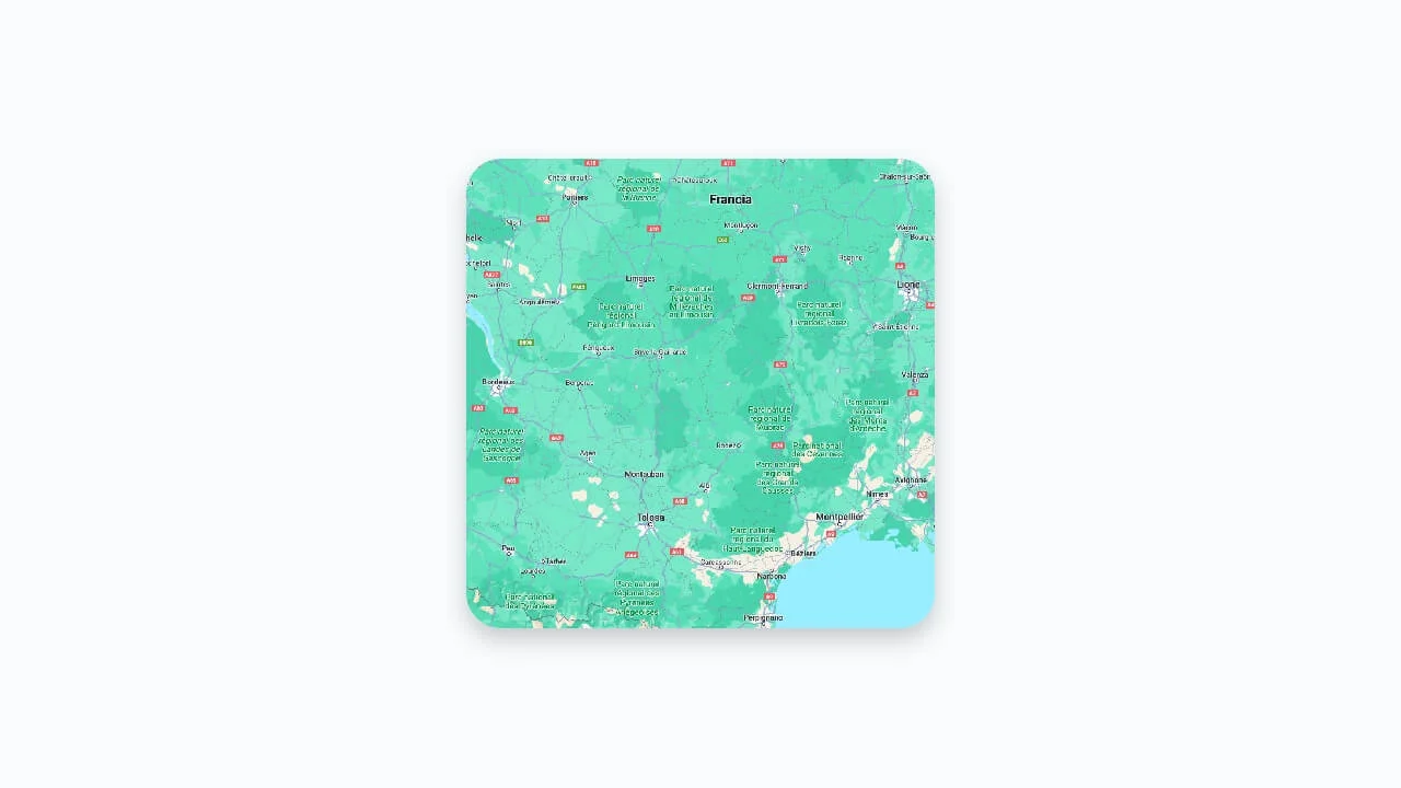
Smooth Blur
About a code The div element is styled to have a width of 50vmin and an aspect ratio of 1/1, making it responsive and square-shaped. It has a border-radius of 2rem, giving it rounded corners. A box-shadow is applied for a subtle lifting effect. An ::after pseudo-element with a backdrop-filter is used to create a blur effect. The image inside the div is positioned absolutely and scaled to cover the entire div with some overflow, ensuring it fills the container while maintaining its aspect ratio.
About a code

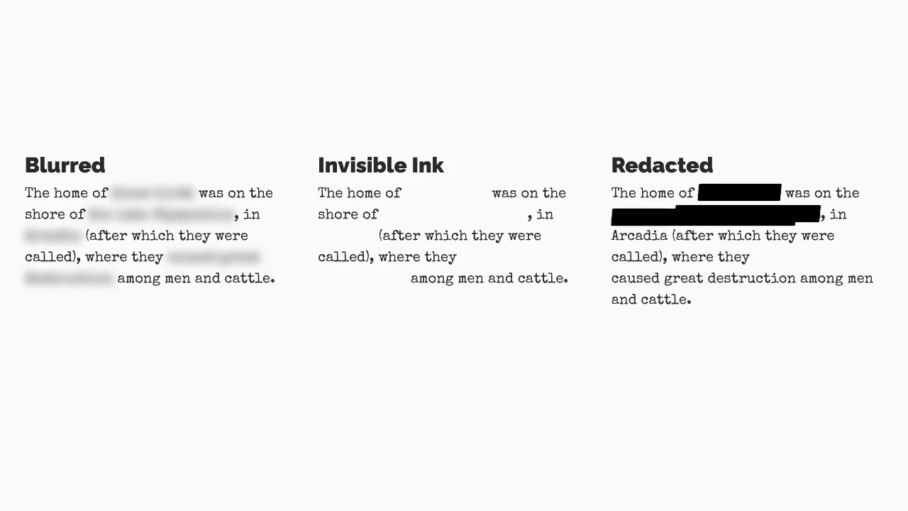
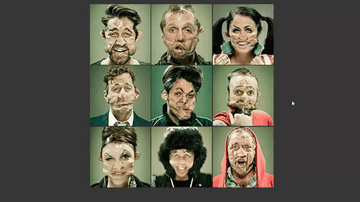
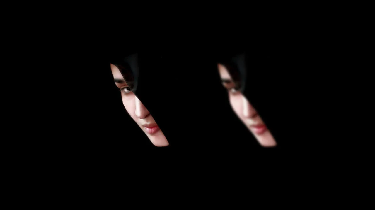
Blurred, Invisible Ink, and Redacted Text
Adam Ruf | May 2, 2016
HTML / CSS (SCSS)
About a code
Exploring some ways of visually hiding or obscuring text with CSS filters and pseudo-elements.
Chrome, Edge, Firefox, Opera, Safari
yes
bootstrap.css


Discover Our Extensive Snippet Library
This heading suggests that your website provides a wide variety of snippets across different technologies, encouraging users to explore and use these resources for their development projects.
HTML Snippets.
Explore a collection of HTML snippets designed to streamline your web development process. From basic structures to complex elements.
CSS Snippets.
Discover powerful CSS snippets that help you style your web pages with ease. Whether you need layout solutions, animations
JavaScript Snippets.
Enhance your website's interactivity with our JavaScript snippets. From DOM manipulation to advanced algorithms
Bootstrap Snippets.
Leverage the power of Bootstrap with our collection of snippets. Quickly integrate responsive design components
Tailwind Snippets.
Speed up your development process with Tailwind CSS snippets. These utility-first CSS snippets enable you to
jQuery Snippets.
Simplify your JavaScript development with jQuery snippets. Easily perform common tasks like event handling, animations
Let's craft a visual identity that ignites passion and loyalty. ✨